Stepping into the dynamic arena of marketing, colours take on a role that’s nothing short of transformative. They become strategic tools, capable of moulding a brand’s identity, luring in customers, and tipping the scales in favour of conversions. In this blog, we will focus on two important factors: Colour theory and colour psychology.
In the realm of colour psychology, we will unravel the intricate threads that tie colours to our emotions.
With a focus on colour theory, we will unearth the hidden complexities that give colours their power and unveil techniques that will help you choose the perfect colour combinations.
Colour Psychology
Colour psychology is the study of how different colours influence human emotions, thoughts, and behaviours. It explores the connections between specific colours and the psychological responses they evoke.
According to Hailey van Braam, a Cognitive Psychologist, research findings emphasise the immense influence of colour on consumer perceptions:
- Brand Recognition: Effective use of colour increases brand recognition by a whopping 80%. This means that a well-chosen colour scheme can make your brand instantly recognisable and memorable.
- Visual Appearance: Colours enhance the visual appearance of products, with a staggering increase of 93%. The right colour choices can make products more appealing and visually attractive to consumers.
- Purchase Decision: Colour isn’t just about aesthetics; it directly impacts purchase decisions. Approximately 85% of consumers make purchases based on colour alone, showcasing its significance in driving consumer behaviour.
The Psychology Behind Colour Choices
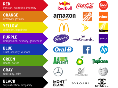
Blue
- Emotions and Feelings: Blue is often associated with feelings of calmness, serenity, and tranquillity. It can promote a sense of relaxation and lower stress levels.
- Symbolism: Blue is often connected to trust, loyalty, and dependability. It can also represent professionalism and intelligence.
Green
- Emotions and Feelings: Green is often connected to feelings of growth, renewal, and harmony. It can evoke a sense of balance and relaxation.
- Symbolism: Green is closely tied to nature, representing freshness, fertility, and vitality. It can also symbolise wealth and abundance.
Purple
- Emotions and Feelings: Purple is often linked to feelings of creativity, luxury, and spirituality. It can evoke a sense of mystery and introspection.
- Symbolism: Purple has historically been associated with royalty and power. It can also symbolise individuality and uniqueness.
Brown
- Emotions and Feelings: Brown is often linked to feelings of stability, warmth, and comfort. It can evoke a sense of security and reliability.
- Symbolism: Brown is associated with nature and the earth. It can symbolise grounding, simplicity, and a connection to the natural world.
White
- Emotions and Feelings: White is often connected to feelings of purity, cleanliness, and simplicity. It can evoke a sense of calm and clarity.
- Symbolism: White is associated with innocence, perfection, and new beginnings. It can also symbolise a blank slate.
Red
- Emotions and Feelings: Red is often linked to feelings of passion, energy, and excitement. It can increase heart rate and create a sense of urgency.
- Symbolism: Red is associated with love, power, and courage. It can also symbolise danger and intensity.
Pink
- Emotions and Feelings: Pink is often associated with feelings of sweetness, affection, and empathy. It can evoke a sense of gentleness and nurturing.
- Symbolism: Pink is often connected to femininity and romance. It can also symbolise innocence and playfulness.
Yellow
- Emotions and Feelings: Yellow is often connected to feelings of happiness, positivity, and optimism. It can evoke a sense of warmth and energy.
- Symbolism: Yellow is associated with creativity, intellect, and curiosity. It can also symbolise sunshine and joy.
Orange
- Emotions and Feelings: Orange is often linked to feelings of enthusiasm, warmth, and creativity. It can evoke a sense of excitement and vitality.
- Symbolism: Orange is associated with energy and enthusiasm. It can also symbolise friendliness and sociability.
Grey
- Emotions and Feelings: Gray can evoke feelings of neutrality, balance, and calmness. It’s often seen as a practical and timeless colour.
- Symbolism: Gray is associated with maturity, sophistication, and professionalism. It can also represent a sense of balance between black and white.
Black
- Emotions and Feelings: Black can evoke feelings of sophistication, mystery, and strength. It can create a sense of depth and seriousness.
- Symbolism: Black is often associated with elegance, formality, and authority. It can also symbolise the unknown and hidden aspects.
Colour Theory
Colour theory is a foundational concept that provides a structured approach for designers and marketers to effectively use colours to convey messages, evoke emotions, and create visual harmony. It encompasses both the psychological and visual aspects of colours, to understand how they interact and impact human perception.
How to Use the Colour Wheel
At the heart of the colour theory is the colour wheel. Surely, we have all seen a colour wheel at some point in our lives, but it is more than just a visual representation, it organises colours based on their relationship with one another. The colour wheel helps individuals understand how different colours relate to one another and provides a framework for creating harmonious colour combinations.
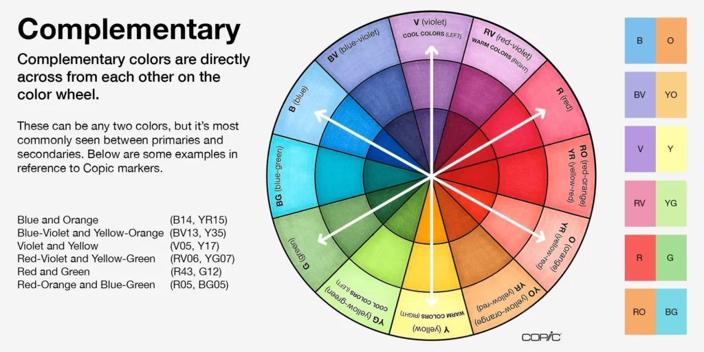
Complementary colours are pairs of colours positioned directly opposite each other on the colour wheel. When combined, they create a striking contrast that makes each colour appear more vibrant. This contrast is visually engaging and draws attention. Examples of complementary pairs include red and green, blue and orange, and yellow and purple.
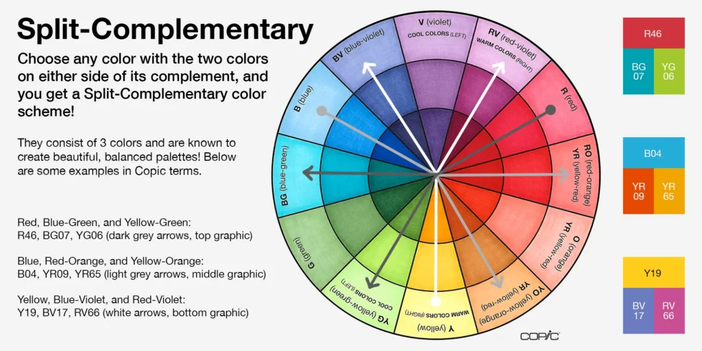
In this scheme, a base colour is combined with two colours adjacent to its complementary colour. This adds a bit more complexity and variation to the complementary combination, while still retaining balance. For example, if the base colour is red, the split complementary scheme might involve green and blue.
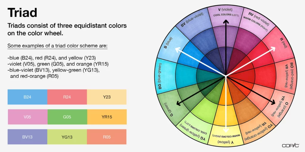
Triadic colour schemes involve selecting three colours that are evenly spaced around the colour wheel. These combinations create a balanced and dynamic palette. Triadic schemes offer variety while ensuring that the colours maintain a sense of harmony. For instance, a triadic scheme might include red, blue, and yellow.
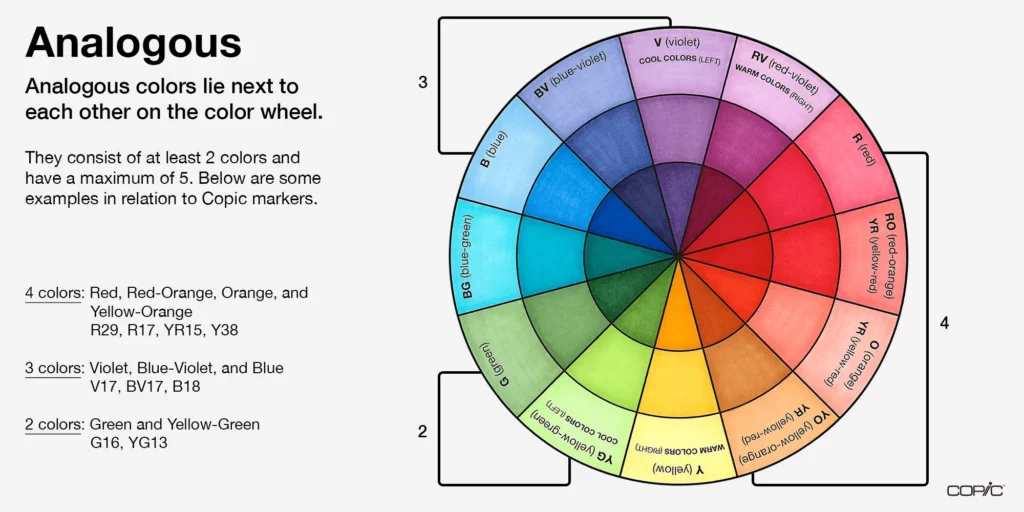
Analogous colours are adjacent to each other on the colour wheel. These colours share a similar undertone, creating a pleasing and harmonious palette. Analogous colour schemes are often used when a gentle and soothing effect is desired. An example of an analogous combination is red, orange, and yellow.
Appropriateness is key
By utilising the principles of the colour wheel and its various combinations, designers and marketers can choose colours that resonate with their intended audience, evoke specific emotions, and create visually appealing compositions. And by keeping colour psychology in mind marketers can easily convey specific meaning.

By utilising the principles of the colour wheel and its various combinations, designers and marketers can choose colours that resonate with their intended audience, evoke specific emotions, and create visually appealing compositions. And by keeping colour psychology in mind marketers can easily convey specific meaning.
But unfortunately, it is not as simple as merely picking a specific colour to convey a specific meaning. The appropriateness of the colour is far more important than the individual colour itself. In other words, does the colour of your branding fit the product or service you are selling?
According to a 2006 study, consumers are more likely to connect positively with a brand when the colour used in its branding resonates with the essence of the product or service it offers.
Let’s break it down: if a brand is all about projecting a sleek, professional image, think deep blues and crisp whites. These colours inherently exude reliability and competence. On the flip side, if a brand is all about tapping into your senses or creating social connections, imagine a splash of vibrant red or orange – colours that signifies energy and excitement.
But it’s not just about throwing colours together haphasardly. The study highlighted that the real magic lies in the harmony between colour and brand image. A brand aiming for a functional, reliable image should opt for a colour palette that reflects those attributes.
A Colourful Conclusion
Colour psychology has shown us how colours are intricately linked to our emotions, capable of evoking a wide array of feelings and associations. From the calming blues to the energetic reds, these hues silently communicate before any words are spoken, demonstrating their significant impact on human perception and decision-making.
At the same time, colour theory has provided a practical framework for designers and marketers to harness colours effectively. The colour wheel, central to this theory, has unveiled the harmonious relationships between hues, guiding us in creating visually appealing compositions that resonate with audiences.
However, the mastery of utilising colour’s power goes beyond the technical aspects. It’s about striking a balance between appropriateness and symbolism. Selecting colours that align with brand identity and encapsulate the essence of products and services is key. The research underscores that the true magic lies in the harmony between colour choices and brand image, a blend that resonates with consumers on a meaningful level.
